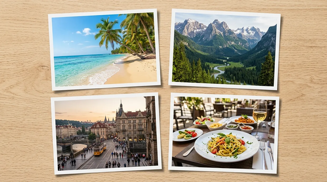
Here is a pattern I finally noticed after years of posting trip photos: single images get a glance, but a tight four-photo grid gets studied. Collages work because they tell a sequence — morning, chaos, summit, sunset — in one glanceable frame. The good news is you no longer need Canva's templates or Photoshop layers. A grid, a gap choice, and two minutes is the whole craft. Let me show you the decisions that separate great collages from cluttered ones.
Pick the Layout Before Touching Photos
Layout is storytelling, so choose it first. Grids (2×2) suit recaps and dumps — four moments, equal weight, maximum density. Side-by-side pairs exist for comparison: before/afters, expectations vs reality, old apartment vs new. Vertical stacks match phone screens and Pinterest's tall preference, earning disproportionate saves. The amateur mistake is cramming six photos into a grid meant for four; white space is a feature, and three strong photos beat six mediocre ones every time.
The 5-Minute Method
- Open the Photo Collage Maker and drop in 2–4 photos. Ruthlessly cut the weakest first — collages amplify quality differences.
- Choose the layout that matches your story (see above), then set the gap: thin dark gaps read editorial, white frames read classic-album.
- Check faces and edges — center-crop trimming eats frame edges first, so nudge compositions with breathing room around subjects.
- Download the 1200px HD JPG and post it as one image instead of an album. Single-image posts consistently outperform multi-photo carousels for completion.
Resolution Reality Check
Each cell of a 1200px 2×2 grid shows at 600px, which is plenty for feeds but thin for printing. Rule of thumb: collages are for screens. If print is the goal, build at the largest size available and accept bigger files — or better, print the single best frame full-size and skip the collage entirely.
Collage FAQs
How many photos is too many?
Four. Beyond that, individual moments shrink past emotional readability on phones, and the piece becomes texture instead of story. Split big sets into themed collages instead.
Should gaps be dark or white?
Dark gaps (near-black) make colors pop and suit travel/night content; white gaps feel airy and suit weddings, babies, and minimal feeds. Match the gap to your profile's overall palette for a coherent grid.
Can I mix portrait and landscape shots?
Yes — cover-fit rendering fills each cell and trims overflow automatically. Just avoid putting critical subjects (faces, text) near edges, since that is exactly what gets trimmed.
Occasion Playbook: Which Collage for What
Different moments want different grids. Weddings: white-framed 2×2, ceremony–candid–detail–dancefloor sequence, printed large — white reads bridal and the order tells the day. Before/afters (renovations, fitness, design work): strict side-by-side pairs, same angle both shots, zero gap ambiguity about what changed. Product variants: grid with identical lighting and background across cells so colorways compare honestly. Social dumps: mixed 3-cell stacks perform best, lead with the strongest frame because feeds crop previews. Memorials and tributes: single-column stacks read processionally, top (earliest) to bottom (latest). Match layout to ritual and the collage feels inevitable rather than assembled.
Sitting on a camera roll full of trip photos? Grid them.
Make a Collage Free